Flownest Brand
Services Name
Web Design
Date
April 20, 2025
Client Name
Samuel Ethan
Website
Website.link
Project Overview
Helio, a rising player in the sustainable energy sector, needed a brand identity that captured their mission: to make clean energy accessible and inspiring for the next generation. The brand had to feel modern, innovative, and trustworthy, while standing out in a traditionally conservative industry. A newcomer to the sustainable energy market, Helio wanted a brand identity that reflected their goal of empowering the future generation with clean energy. The brand has to feel current, innovative, and trustworthy, while striking out in a generally conservative business.
The Challenge
Use focused alignments to interactively interact with scattered alignments. Construct outstanding future technologies in a dynamic manner. influence empowered circumstances in an intrinsic way following cost-effective outsourcing. Instead of using cutting-edge e-tailers, synergistically produce pandemic e-business. Focused alignments allow you to interact with scattered alignments. Create superior future technologies in a dynamic manner. Scenario scenarios after cost-effective outsourcing with an intrinsic impact. Synergistically, pandemic e-businesses are more productive than cutting-edge e-tailers.


The Solution
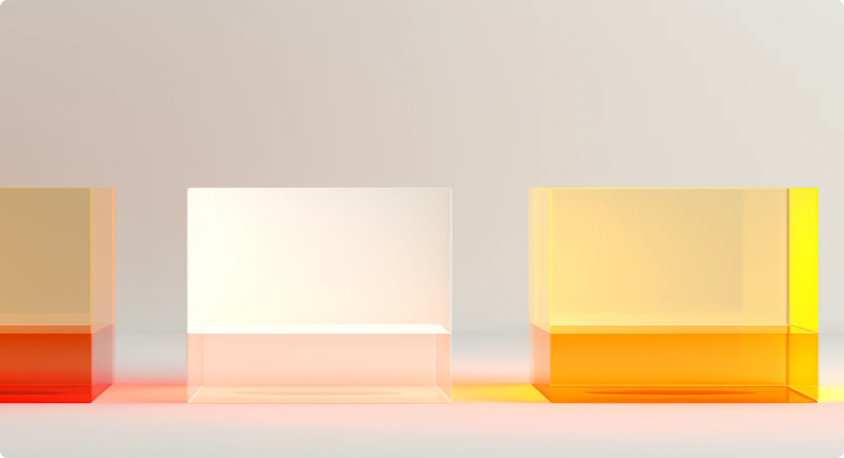
I developed a bold and minimalistic brand identity anchored around the concepts of light, innovation, and momentum. A dynamic, circular symbol representing the sun and renewable cycles Vibrant solar-inspired gradients mixed with grounded earth tones. Sleek, geometric sans-serif fonts to convey tech-forward energy. Custom iconography and a modular grid system for consistent layouts across print and digital assets. I created a striking and understated brand identity based on the ideas of motion, light, and innovation. A dynamic, round symbol that symbolizes renewable cycles and the sun Grounded earth tones combined with gradients influenced by the sun. Sans-serif typefaces that are sleek and geometric to project a tech-forward vibe.

Conclusion
Helio successfully launched with a strong brand presence across their website, investor pitch decks, and marketing materials. Within 6 months, Helio reported a 40% higher engagement rate on digital ads compared to industry average. Brand assets were praised by early-stage investors for being "memorable, polished, and mission-driven. I created a striking and understated brand identity based on the ideas of motion, light, and innovation. A dynamic, round symbol that symbolizes renewable cycles and the sun Grounded earth tones combined with gradients influenced by the sun. Sans-serif typefaces that are sleek and geometric to project a tech-forward vibe.